

SwiftUI: How to use custom fonts and images in a Swift Package
Create a design system module with custom fonts, reusable components, and working Xcode Previews


Update: Cross module Previews fixed in Xcode 14!
Note: As of Xcode 14 b4, the trickery of using the bundle: .designSystem is no longer necessary. You can use bundle: .module as expected. Apple was true to its word in the SwiftUI Digital Lounges and fixed this bug. From the release notes:
Xcode Previews now works with packages containing resources that aren’t also contained in an app. (96828503)
Note: The rest of the article on how to set up a design system module is still fully relevant, as well as the custom font workarounds.
Background
Modern iOS development is moving towards SwiftUI, while using Swift Package Manager (SPM) to handle internal and external dependencies. The iOS team at Shift has been working this way for about a year. It's dramatically faster to develop, with excellent modularization.
We have been using a similar approach to modularization as PointFree, where we have a single Swift Package with a single Package.swift file, and multiple feature modules which are completely isolated from each other. This reduces tightly-coupled spaghetti code.
Xcode Previews are a fantastic way to see at a glance how a view is used. They let you see the view in different contexts on different devices sizes, accessibility settings, dark/light mode, etc. They've been one of the biggest boons to rapid development and iteration, and really help new team members get up to speed. For SwiftUI, spitting up features into modules is important to keep Xcode Previews working. Once your app is a certain size, the Previews will fail to load because they take more than 5 seconds to render.
Our company also uses a design system. This consists of custom fonts, images like logos, and reusable view components that are used throughout the app.
Goal
- Have all of our design system components (fonts, views) contained in a single Swift Package Manager module.
- Be able to specify SwiftUI fonts using Dynamic Type styles, e.g.
.font(.bodyCustom). These might represent different fonts themselves, or different weights. - Be able to import the design system module into feature modules .
- Have the Xcode Previews for those feature modules work, including custom fonts and reusable components/assets from the design system.
Complete Code
If you'd rather just dive into the code, I have a complete app example on GitHub.
The Approach
Let's first look at the Package.swift file:
// swift-tools-version:5.5

import PackageDescription

let package = Package(
    name: "CustomFontsPackage",
    platforms: [
        .iOS(.v15),
    ],
    products: [
        .library(name: "FeatureModule", targets: ["FeatureModule"]),
        .library(name: "DesignSystem", targets: ["DesignSystem"]),
    ],
    dependencies: [],
    targets: [
        .target(
            name: "FeatureModule",
            dependencies: [
                "DesignSystem",
            ]
        ),
        .target(
            name: "DesignSystem",
            dependencies: [],
            resources: [
                .process("Sources/Resources"),
            ]
        ),
    ]
)
The DesignSystem module contains all of the custom fonts, reusable views and image assets used in other parts of the system. It has as few dependencies as possible, ideally none. For each feature, we'd create a new module/target similar to FeatureModule. Also most all of them will depend on DesignSystem. Note that you can also include third-party SPM dependencies in this file.
Filesystem Layout
This is the layout of our Swift Package on the filesystem. You can see all the fonts and an asset catalog of images are located here. In the Package.swift you must mark these resources as .process() so they can be used by other modules.

Fonts
Let's cover the approach for defining our custom font styles, and registering them with the application.
Specifying the Dynamic Type styles using custom fonts
Here is the Font+Custom.swift file:
import SwiftUI

extension Font {
    public static let largeTitleCustom = Font.custom("Lobster-Regular", size: 34, relativeTo: .largeTitle)
    public static let titleCustom = Font.custom("Lobster-Regular", size: 28, relativeTo: .title)
    public static let title2Custom = Font.custom("Lobster-Regular", size: 22, relativeTo: .title2)
    public static let title3Custom = Font.custom("Lobster-Regular", size: 20, relativeTo: .title3)
    public static let headlineCustom = Font.custom("Lobster-Regular", size: 17, relativeTo: .headline)
    public static let subheadlineCustom = Font.custom("Lobster-Regular", size: 15, relativeTo: .subheadline)
    public static let bodyCustom = Font.custom("SyneMono-Regular", size: 17, relativeTo: .body)
    public static let calloutCustom = Font.custom("SyneMono-Regular", size: 16, relativeTo: .callout)
    public static let footnoteCustom = Font.custom("SyneMono-Regular", size: 13, relativeTo: .footnote)
    public static let captionCustom = Font.custom("SyneMono-Regular", size: 12, relativeTo: .caption)
    public static let caption2Custom = Font.custom("SyneMono-Regular", size: 11, relativeTo: .caption2)
}

public enum CustomFonts {
    public static func registerCustomFonts() {
        for font in ["SyneMono-Regular.ttf", "Lobster-Regular.ttf"] {
            guard let url = Bundle.designSystem.url(forResource: font, withExtension: nil) else { return }
            CTFontManagerRegisterFontsForURL(url as CFURL, .process, nil)
        }
    }
}

extension View {
    /// Attach this to any Xcode Preview's view to have custom fonts displayed
    /// Note: Not needed for the actual app
    public func loadCustomFonts() -> some View {
        CustomFonts.registerCustomFonts()
        return self
    }
}
This uses the new iOS 14 API for custom fonts. Read a bit more about it here at Hacking with Swift.
In the app, we will be able to set the dynamic type font for any Text like so:
Text("Hello, World")
    .font(.title3Custom)
Registering the fonts
Due to our goal of having this work in both Swift Package modules and Xcode Previews, I recommend registering your fonts the following way:
import DesignSystem
import SwiftUI

@main
struct SwiftUICustomFontsApp: App {

    init() {
        CustomFonts.registerCustomFonts()
    }

    var body: some Scene {
        WindowGroup {
            ContentView()
        }
    }
}
This will register all your custom fonts with the system. At this point, your custom fonts will work from within any of your Swift Package modules in the compiled running app. However, Xcode Previews will still not always show the custom font.
Note: The old way of including custom fonts was to add the <key>UIAppFonts</key> to your Info.plist. You can still do this if you want, for example if you have a mixed UIKit/SwiftUI app. In that scenario, you need to duplicate the font files in your main target (not just the Swift Package) to ensure they are copied into the final bundle. If you do that, you don't even need to make the registerCustomFonts() call, except that Xcode Previews still won't always show the custom font.
Fixing Xcode Previews for Custom Fonts
At this point, the compiled running app uses the custom fonts and works well. The Xcode Previews are a mixed bag though. Any views within your main app target, if it's small enough, will properly show the custom fonts. However, any views contained within your Swift Package Manager feature modules will not. Xcode Previews do not run the global App.init() when running, and don't look at Info.plist UIAppFonts either. We need a different approach.
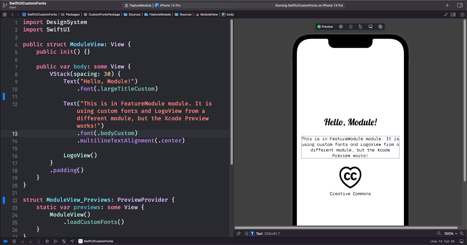
First, what it looks like when used. This is a file in the FeatureModule:
import DesignSystem
import SwiftUI

public struct ModuleView: View {
    public init() {}

    public var body: some View {
        Text("Hello, Module!")
            .font(.largeTitleCustom)
    }
}

struct ModuleView_Previews: PreviewProvider {
    static var previews: some View {
        ModuleView()
            .loadCustomFonts()
    }
}
We need to use .loadCustomFonts() to quickly run the registration code that we also have in App.init(), before rendering any preview. Thanks to u/camji55 for this idea.
Behold: working SwiftUI Previews with custom fonts! Note that this is previewing FeatureModule, not DesignSystem.
Unfortunately you need to do this in every preview. To help with this, I've created a CommonPreviews helper which automatically previews my view on a few different devices sizes, with dark mode, and accessibility dynamic type. It also loads the custom fonts so I don't need to remember that:
import SwiftUI

public struct CommonPreviews<Content: View>: View {
    let content: Content

    public init(@ViewBuilder _ content: () -> Content) {
        self.content = content()
    }

    public var body: some View {
        Group {
            // First preview will use whatever device you have selected in Xcode
            self.content
                .environment(\.colorScheme, .light)
                .preferredColorScheme(.light)
                .navigationBarHidden(true)
                .previewDisplayName("Currently selected iPhone")

            self.content
                .environment(\.colorScheme, .dark)
                .preferredColorScheme(.dark)
                .navigationBarHidden(true)
                .previewDevice("iPhone SE (1st generation)")
                .previewDisplayName("iPhone SE, dark mode")

            self.content
                .environment(\.colorScheme, .light)
                .preferredColorScheme(.light)
                .navigationBarHidden(true)
                .previewDevice("iPhone 8")
                .previewDisplayName("iPhone 8, dynamic text")
                .environment(\.sizeCategory, .accessibilityMedium)
        }
        .loadCustomFonts()
    }
}
You use CommonPreviews as follows:
struct ModuleView_Previews: PreviewProvider {
    static var previews: some View {
        CommonPreviews {
            ModuleView()
        }
    }
}
The Secret Sauce
Note: Fixed in Xcode 14!
As of Xcode 14 b4, the trickery of using the . bundle: .designSystem is no longer necessary. You can use .bundle: .module as expected.
Xcode 13 Approach
There is one crucial bit of code I haven't shown yet, and it's the Bundle.designSystem shown in the Font+Custom.swift file. Normally, you would pick Bundle.main for your main app target, or Bundle.module for a SPM module target. However, neither of these work for Xcode Previews.
Note: If you don't care about seeing the custom fonts in other module previews, just use Bundle.module.url() in Font+Custom.swift.
After searching the web, I found this solution which I adapted into my Bundle+Extensions.swift file:
import UIKit

extension Bundle {
    private class CurrentBundleFinder {}

    /// This is used to allow you to use resources from DesignSystem in other Swift Package previews.
    /// Inspiration from here: https://developer.apple.com/forums/thread/664295
    public static var designSystem: Bundle = {
        // The name of your local package bundle. This may change on every different version of Xcode.
        // It used to be "LocalPackages_<ModuleName>" for iOS. To find out what it is, print out  the path for
        // Bundle(for: CurrentBundleFinder.self).resourceURL?.deletingLastPathComponent().deletingLastPathComponent()
        // and then look for what bundle is named in there.
        let bundleNameIOS = "CustomFontsPackage_DesignSystem"
        let candidates = [
            // Bundle should be present here when the package is linked into an App.
            Bundle.main.resourceURL,
            // Bundle should be present here when the package is linked into a framework.
            Bundle(for: CurrentBundleFinder.self).resourceURL,
            // For command-line tools.
            Bundle.main.bundleURL,
            // Bundle should be present here when running previews from a different package
            // (this is the path to "…/Debug-iphonesimulator/").
            Bundle(for: CurrentBundleFinder.self)
                .resourceURL?
                .deletingLastPathComponent()
                .deletingLastPathComponent()
                .deletingLastPathComponent(),
            Bundle(for: CurrentBundleFinder.self)
                .resourceURL?
                .deletingLastPathComponent()
                .deletingLastPathComponent(),
        ]

        for candidate in candidates {
            let bundlePathiOS = candidate?.appendingPathComponent(bundleNameIOS + ".bundle")
            if let bundle = bundlePathiOS.flatMap(Bundle.init(url:)) {
                return bundle
            }
        }
        fatalError("Can't find designSystem custom bundle. See Bundle+Extensions.swift")
    }()
}
You might need to change:
public static var designSystem: Whatever custom name you want to use for this bundle that's used in Xcode Previews.let bundleNameIOS = "CustomFontsPackage_DesignSystem"The first part before the underscore is yourPackage.swift'snameproperty. The part after the underscore is your module name.
This is a bit hacky, and fragile to be sure. It defines a custom Bundle that searches every possible bundle path (including .main) to find where those custom fonts and assets are located. The nice thing is that this works both in Xcode Previews and in the actual final app, but no warranty is implied here! This has actually broken between different Xcode versions for me. See the comment in there for troubleshooting the correct path to use.
Hopefully at some point in the future, the Xcode Previews team will make it not necessarily to use hacks like this to load assets/fonts across module boundaries.
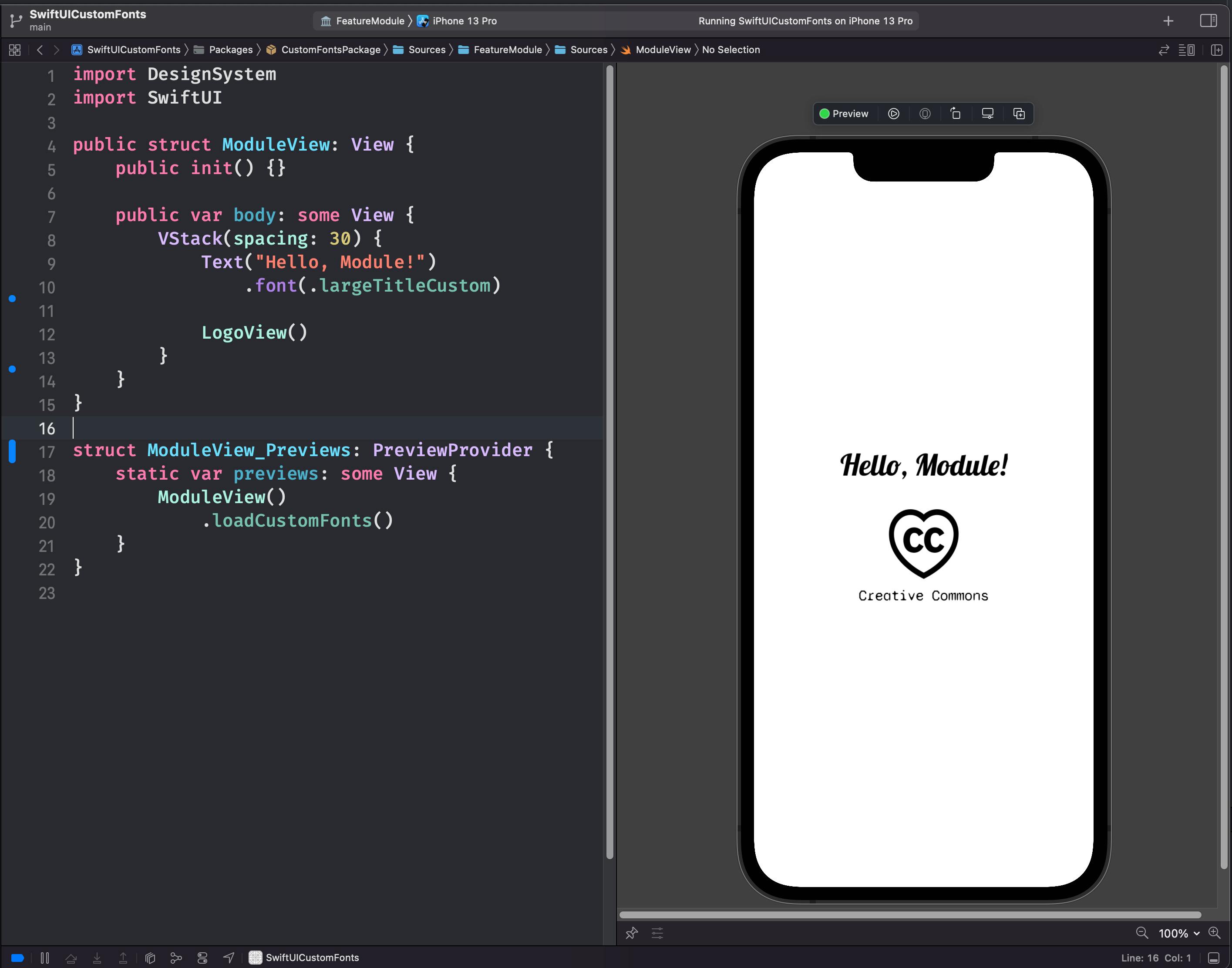
Loading Image assets and Views from a different module
Sometimes you want to make a custom view that contains an image asset, e.g. a company logo that gets displayed in multiple places. It's easy to define one in a shared module, import that elsewhere, but it has an even worse problem than fonts - Xcode Previews will crash when you try to preview the feature module that uses it.
Luckily, the root cause is the same, and we can use the same Bundle.designSystem approach. When loading the image from your module's asset catalog, use .designSystem instead of .module:
import SwiftUI

public struct LogoView: View {
    public init() {}

    public var body: some View {
        VStack {
            Image("logo", bundle: .designSystem)
                .resizable()
                .frame(width: 80, height: 80)

            Text("Creative Commons")
                .font(.bodyCustom)
        }
    }
}
Now when you are in a feature module, your previews will work! Note that LogoView() and the Creative Commons logo asset are stored in DesignSystem, not in FeatureModule that we are previewing here.
Conclusion
Today we discovered how to use custom fonts and image assets in a SwiftUI app that makes use of Swift Package Manager modules. We can encapsulate them in a single DesignSystem module, and use it anywhere in our app including other SPM modules. Crucially, we managed to keep Xcode Previews working. This allows a highly modular, reusable design system/component library approach.
To view a complete working example, I have an example on GitHub:
https://github.com/jgale/SwiftUICustomFonts
If you have any questions, get in touch on Twitter: @jgale_ios
Thanks for reading!