SwiftUI: How to use custom fonts, colors, and images in a Swift Package
Create a design system module with custom fonts, colors, images, reusable components, and working Xcode Previews
I am a developer from Calgary, Canada. I've been developing for iOS since 2009. I've created my own apps from scratch, including the app version of a famous Calgary restaurant reviewer's books. (Long since gone from the App Store). For the past two years, I've been using SwiftUI almost exclusively and have never had more fun writing apps.
Background
Modern iOS development is moving towards SwiftUI, while using Swift Package Manager (SPM) to handle internal and external dependencies. My last 3 jobs have all had a similar setup. It's dramatically faster to develop, with excellent modularization.
We have been using a similar approach to modularization as PointFree, where we have a single Swift Package with a single Package.swift file, and multiple feature modules which are completely isolated from each other. This reduces tightly-coupled spaghetti code.
Xcode Previews are a fantastic way to see at a glance how a view is used. They let you see the view in different contexts on different devices sizes, accessibility settings, dark/light mode, etc. They've been one of the biggest boons to rapid development and iteration, and really help new team members get up to speed. For SwiftUI, spitting up features into modules is important to keep Xcode Previews working. Once your app is a certain size, the Previews will fail to load because they take more than 5 seconds to render.
Our company also uses a design system. This consists of custom fonts, colors, images like logos, and reusable view components that are used throughout the app.
Goal
Have all of our design system components (fonts, colors, shared images, views) contained in a single Swift Package Manager module.
Be able to specify SwiftUI fonts using Dynamic Type styles, e.g.
.font(.bodyCustom). These might represent different fonts themselves, or different weights.Be able to import the design system module into feature modules .
Have the Xcode Previews for those feature modules work, including custom fonts and reusable components/assets from the design system.
Complete Code
If you'd rather just dive into the code, I have a complete app example on GitHub.
The Approach
Let's first look at the Package.swift file:
// swift-tools-version:5.5

import PackageDescription

let package = Package(
    name: "CustomFontsPackage",
    platforms: [
        .iOS(.v15),
    ],
    products: [
        .library(name: "FeatureModule", targets: ["FeatureModule"]),
        .library(name: "DesignSystem", targets: ["DesignSystem"]),
    ],
    dependencies: [],
    targets: [
        .target(
            name: "FeatureModule",
            dependencies: [
                "DesignSystem",
            ]
        ),
        .target(
            name: "DesignSystem",
            dependencies: [],
            resources: [
                .process("Sources/Resources"),
            ]
        ),
    ]
)
The DesignSystem module contains all of the custom fonts, colors, reusable views and image assets used in other parts of the system. It has as few dependencies as possible, ideally none. For each feature, we'd create a new module/target similar to FeatureModule. Also most all of them will depend on DesignSystem. Note that you can also include third-party SPM dependencies in this file.
Filesystem Layout
This is the layout of our Swift Package on the filesystem. You can see all the fonts and an asset catalog of images are located here. In the Package.swift you must .process() these resources so they can be used by other modules.

Fonts
Let's cover the approach for defining our custom font styles, and registering them with the application.
Specifying the Dynamic Type styles using custom fonts
Here is the Font+Custom.swift file:
import SwiftUI

extension Font {
    public static let largeTitleCustom = Font.custom("Lobster-Regular", size: 34, relativeTo: .largeTitle)
    public static let titleCustom = Font.custom("Lobster-Regular", size: 28, relativeTo: .title)
    public static let title2Custom = Font.custom("Lobster-Regular", size: 22, relativeTo: .title2)
    public static let title3Custom = Font.custom("Lobster-Regular", size: 20, relativeTo: .title3)
    public static let headlineCustom = Font.custom("Lobster-Regular", size: 17, relativeTo: .headline)
    public static let subheadlineCustom = Font.custom("Lobster-Regular", size: 15, relativeTo: .subheadline)
    public static let bodyCustom = Font.custom("SyneMono-Regular", size: 17, relativeTo: .body)
    public static let calloutCustom = Font.custom("SyneMono-Regular", size: 16, relativeTo: .callout)
    public static let footnoteCustom = Font.custom("SyneMono-Regular", size: 13, relativeTo: .footnote)
    public static let captionCustom = Font.custom("SyneMono-Regular", size: 12, relativeTo: .caption)
    public static let caption2Custom = Font.custom("SyneMono-Regular", size: 11, relativeTo: .caption2)
}

public enum CustomFonts {
    public static func registerCustomFonts() {
        for font in ["SyneMono-Regular.ttf", "Lobster-Regular.ttf"] {
            guard let url = Bundle.module.url(forResource: font, withExtension: nil) else { return }
            CTFontManagerRegisterFontsForURL(url as CFURL, .process, nil)
        }
    }
}

extension View {
    /// Attach this to any Xcode Preview's view to have custom fonts displayed
    /// Note: Not needed for the actual app
    public func loadCustomFonts() -> some View {
        CustomFonts.registerCustomFonts()
        return self
    }
}
This uses the iOS 14 API for custom fonts. Read a bit more about it here at Hacking with Swift.
In the app, we will be able to set the dynamic type font for any Text like so:
Text("Hello, World")
    .font(.title3Custom)
Registering the fonts
Due to our goal of having this work in both Swift Package modules and Xcode Previews, I recommend registering your fonts the following way:
import DesignSystem
import SwiftUI

@main
struct SwiftUICustomFontsApp: App {

    init() {
        CustomFonts.registerCustomFonts()
    }

    var body: some Scene {
        WindowGroup {
            ContentView()
        }
    }
}
This will register all your custom fonts with the system. At this point, your custom fonts will work from within any of your Swift Package modules in the compiled running app. However, Xcode Previews will still not always show the custom font.
Note: The old way of including custom fonts was to add the <key>UIAppFonts</key> to your Info.plist. You can still do this if you want, for example if you have a mixed UIKit/SwiftUI app. In that scenario, you need to duplicate the font files in your main target (not just the Swift Package) to ensure they are copied into the final bundle. If you do that, you don't even need to make the registerCustomFonts() call, except that Xcode Previews still won't always show the custom font.
Fixing Xcode Previews for Custom Fonts
At this point, the compiled running app uses the custom fonts and works well. The Xcode Previews are a mixed bag though. Any views within your main app target, if it's small enough, will properly show the custom fonts. However, any views contained within your Swift Package Manager feature modules will not. Xcode Previews do not run the global App.init() when running, and don't look at Info.plist UIAppFonts either. We need a different approach.
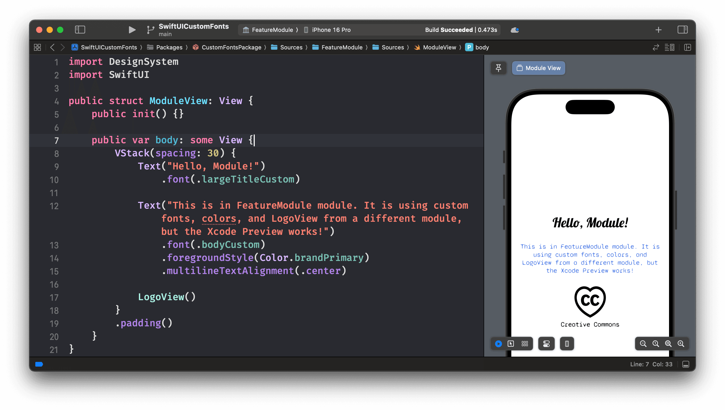
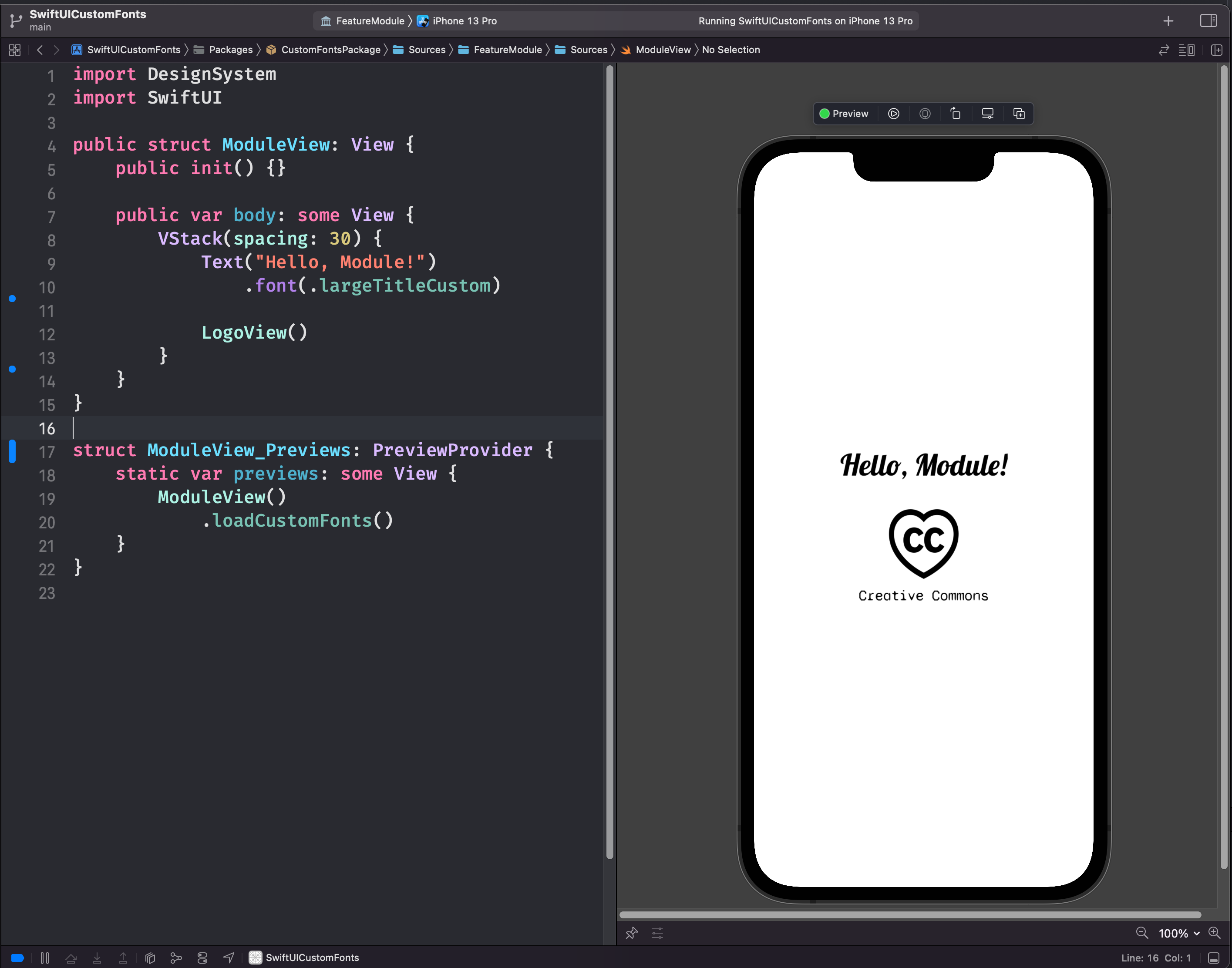
First, what it looks like when used. This is a file in the FeatureModule:
import DesignSystem
import SwiftUI

public struct ModuleView: View {
    public init() {}

    public var body: some View {
        Text("Hello, Module!")
            .font(.largeTitleCustom)
    }
}

struct ModuleView_Previews: PreviewProvider {
    static var previews: some View {
        ModuleView()
            .loadCustomFonts()
    }
}
We need to use .loadCustomFonts() to quickly run the registration code that we also have in App.init(), before rendering any preview. Thanks to u/camji55 for this idea.
Behold: working SwiftUI Previews with custom fonts! Note that this is previewing FeatureModule, not DesignSystem.

Unfortunately you need to do this in every preview. To help with this, I've created a CommonPreviews helper which automatically previews my view on a few different devices sizes, with dark mode, and accessibility dynamic type. It also loads the custom fonts so I don't need to remember that:
import SwiftUI

public struct CommonPreviews<Content: View>: View {
    let content: Content

    public init(@ViewBuilder _ content: () -> Content) {
        self.content = content()
    }

    public var body: some View {
        Group {
            // First preview will use whatever device you have selected in Xcode
            self.content
                .environment(\.colorScheme, .light)
                .preferredColorScheme(.light)
                .navigationBarHidden(true)
                .previewDisplayName("Currently selected iPhone")

            self.content
                .environment(\.colorScheme, .dark)
                .preferredColorScheme(.dark)
                .navigationBarHidden(true)
                .previewDevice("iPhone SE (3rd generation)")
                .previewDisplayName("iPhone SE, dark mode")

            self.content
                .environment(\.colorScheme, .light)
                .preferredColorScheme(.light)
                .navigationBarHidden(true)
                .previewDevice("iPhone 16 Pro")
                .previewDisplayName("iPhone 16 Pro, dynamic text")
                .environment(\.sizeCategory, .accessibilityMedium)
        }
        .loadCustomFonts()
    }
}
You use CommonPreviews as follows:
struct ModuleView_Previews: PreviewProvider {
    static var previews: some View {
        CommonPreviews {
            ModuleView()
        }
    }
}
Loading Image assets and Views from a different module
Sometimes you want to make a custom view that contains an image asset, e.g. a company logo that gets displayed in multiple places. In the past, this used to crash Xcode. But now it's easy to define one in a shared module and import that elsewhere when you want to use it.
import SwiftUI

public struct LogoView: View {
    public init() {}

    public var body: some View {
        VStack {
            Image("logo", bundle: .module)
                .resizable()
                .frame(width: 80, height: 80)

            Text("Creative Commons")
                .font(.bodyCustom)
        }
    }
}
Now when you are in a feature module, your previews will work! Note that LogoView() and the Creative Commons logo asset are stored in DesignSystem, not in FeatureModule that we are previewing here.
Using shared brand colors from a DesignSystem module
Colors are similarly easy. Add the colors in an xcassets catalog (or define programatically if you prefer). I’m using Xcode 15’s automatic typesafe asset name generation here (SwiftGen is another option). Unfortunately it doesn’t provide access to those colors outside of the module they are declared in, so I’m defining public extensions of Color.

import SwiftUI

extension Color {
    public static let brandPrimary = Color(.dsBrandPrimary)
}
You can then use those in a different module exactly how you’d expect, i.e. .foregroundStyle(Color.brandPrimary).

Conclusion
Today we discovered how to use custom fonts, colors, and image assets in a SwiftUI app that makes use of Swift Package Manager modules. We can encapsulate them in a single DesignSystem module, and use it anywhere in our app including other SPM modules. Crucially, we managed to keep Xcode Previews working. This allows a highly modular, reusable design system/component library approach.
To view a complete working example, I have an example on GitHub:
https://github.com/jgale/SwiftUICustomFonts
If you have any questions, get in touch on Twitter: @jgale_ios
Thanks for reading!